


We’re now two weeks into Attempt #113 and the net total loss is: 0.0 lbs. Yay me. The same problem continues: very little to eat for twenty-three hours of each day, followed by way too much to eat for one hour of each day.
Yes, I’m acutely aware of the fact that this is completely the wrong way to go about this. I’m not trying to justify anything, only reporting the facts as they stand. I’m filing this squarely under “it is what it is.”
So I don’t really have much else to report this week. Which means I have plenty of extra time to give Deb a little present: more graphs!
It’s not uncommon for life-altering events to split one’s life into Before and After. Two years ago I experienced a life-altering event of my own: I went an entire month without logging into Facebook. This really helped me put things into perspective, and I’ve since spent much less time there. Because of this, I can divide my life into BC (Before Clarity) and AC (After Clarity).
[ED: Okay, for anyone who might be new here, the C actually stands for this.]
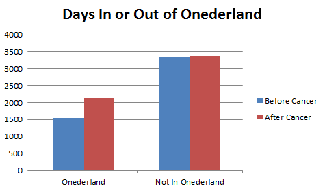
Our first graph this week shows the detailed breakdown between “In Onederland” and “Not In Onederland” with the values counted by weight decade, measured both BC and AC.
(Also, you can’t see it, but there were actually two days in the 160s. That isn’t just an empty set of columns on the left.)

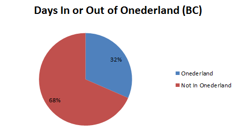
This data becomes (or, for the pedantic: “these data become”) a bit easier to visualize when you see only the in- or out-ness graphed:
Next up, the same data in pie chart form. This shows for all days BC, the percentage of which were either In or Out.
Now, the same approach, but for all days including AC. As you can see, the Onederland part of the chart has grown larger.

But what you can’t really see in that visualization is why the Onederland slice is getting so much larger. It’s because of THIS:
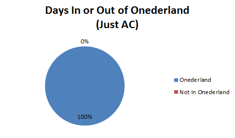
When we only take in the AC days, you can see that I have been in Onederland for almost two years straight. I really do have to keep this in mind when I complain about not losing any weight for a couple weeks. After so many failed attempts at trying to hit this goal, I can’t forget that I’m actually THERE. And have been for about twenty-two months in a row now.
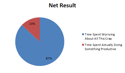
So quit complaining, Charlie. After all, this is the graph you really need to fix:


on March 25, 2014 at 7:10 am
If the occasional fasting-is-good-for-you-approach holds any water the idea your body does without calories for 23 hours at a time might mean your metabolism gets cranked into doing more helpful stuff with the calories you are taking in. Could that explain why you aren’t gaining weight?
There are other supposed gains from the “intermittent fast” approach – something about the type of fat burned and an idea that cells go into “repair” rather than “reproduce” mode. Blah blah sciencey blah. Bet it’d make for some interesting graphs if you ever decide to go there.
Regardless, I’m happy as a clam with the chartopia that is this post. Thank you Charlie!
(ARE clams happy? Why is that the phrase that pops in my head?)
on March 25, 2014 at 10:06 am
I love your charts Charlie. And yes, the big picture is you are under 200 – and that’s a good thing! Having cancer? That was a bad thing – very very bad thing!
I love you!
Love, your prettier sister, Biz
on March 26, 2014 at 1:25 pm
I think we match on the worry/non productive chart.
I think most yo-yo dieters do? Why don’t we just admit defeat and get fat?? lol
😉